New PSAS Logo Page
We're thinking about upgrading our logo. We all love the old one, but no one seems to understand it's an image of Jupiter's rings. But in any case, Frank Matthews, our resident rocket artist, has come up with a few new ones. If we like any of these over the old one, we'll switch to it and make a new poster and get some cards printed (which we need to do no matter what our logo is).
Caveat: I DON'T think that Frank meant them to be viewed altogether like this. But, our gallery program is currently broken so I have to post them on the wiki. Sorry Frank.
Here's what Frank has to say:
All,
Sarah (I’ll blame her :-) asked me a couple months ago to consider revising the PSAS logo in time to purchase a new banner. I was, and still am very interested in working on that, so as to flex my new Graphic Design muscles. I’ve attached the ones that Sarah, Jamie and Ian looked at one Wednesday night.
In general, this is a thankless task. Witness the PR firm hired by PSU to come up with a new “branding” for the university. I think their stuff pretty well stinks, as do others in the PSU Art Dept.
I say the above mainly to say that I assume most of you will think my proposals suck, and that’s just fine with me. I’m not the one who makes the final decision on a logo. That being said, this is a fun exercise, anyway. I’ve worked before with “extreme consensus” groups (it’s not an insult, really!) and know that everyone needs to have at least a chance to chime in on every decision.
So, in the spirit of egoless self-exposure, here are some initial ideas.
Presentation format.
A I had gone through the (minor) effort to put 11 different logos into vector format (including the existing logo). I’m attaching jpegs of these to this message. These aren’t necessarily my favorites, but they show some of the possible variety. Skip the one with the Greek letters. It’s just a joke
B In a followup message, I’ll attach jpegs of scans of my original sketches. One of those might tickle someone’s fancy.
C Anyone should feel free to submit ideas of his or her own. I’d like to offer the service of taking your sketch and rendering it into a nice Illustrator, and an SVG (Inkscape) file, and present it to the group, with full attribution, of course.
Here are some personal considerations:
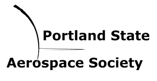
1. The existing logo has a very nice balance to it. It is pretty. However, the curves don’t seem to imply much about student rocketry. According to Andrew, the curves are the limb of Jupiter and one of its rings. How many of you knew that? I originally thought it was a rocket shooting out sideways.
2. The bounding rectangle (aspect ratio) of the logo makes some uses difficult, such as on letterhead, on postcards, on business cards and alongside SALP logos. On a banner from a distance (e.g. hung off the third-floor railing at SMU), the logo’s “density” is rather low. By density, I mean legibility from a distance.
3. Simplicity. NASA and IBM have logos based on their initials. Unfortunately, “PSAS” doesn’t have enough name recognition. I find the IEEE logo even too obscure; I mean, how many ordinary people know the right-hand rule?
4. Rocketry symbology. Should we have a missile rising into the air? How about one curving into orbit? What shape says “rocket” to most people. A dart? A cylinder with fins? A bulbous pointy cylinder as was the German V1 rocket?
5. Is there a visual way to communicate the concept of “open source” to the person in the street?
These are considerations I make when thinking of a logo. I would admonish you to consider these, too, but please resist getting overwhelmed and saying “let’s just keep the one we have.” Where’s the fun in that?
Frank
The Logos
Here's how to vote: Put the numbers 1,2,3 in the ones you like the most. The one with the LEAST number will be our choice. Don't have a wiki login yet? Then just email someone who does (Sarah, Andrew, etc). Voting on these versions ended June 28. No logo was chosen; we just wanted to get an idea of what people liked.
|
Logo Number |
Votes |
Logo |
|
Our current logo |
2, 2, 1, 1 |
|
|
A retread |
1, 1, 1 |
|
|
Logo 1a |
|
|
|
Logo 02 |
3, 3, 3, 3, 2, 2, 2 |
|
|
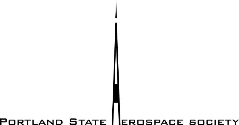
Logo 03 |
1, 2, 2, 1 |
|
|
Logo 04 |
2, 1, 1, 3, 2, 3, 3 |
|
|
Logo 05 |
|
|
|
Logo 06 |
|
|
|
Logo 07 |
|
|
|
Logo 08 |
3 |
|
|
Logo 09 |
3, 967.78 |
|
|
Logo 10 |
|
|
|
Logo 11 |
|
The Results
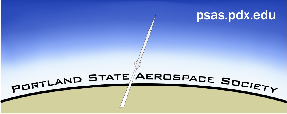
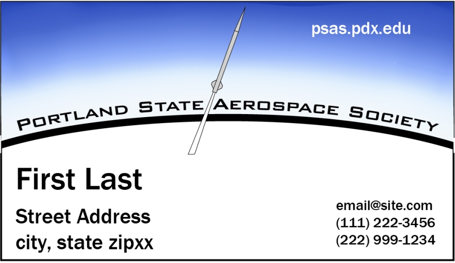
Using Condorcet method, logo #04 was the most popular. The top five logos are the current logo, the retread, logo 02, 03, and 04. For info on the voting process, see the results page. Note that no logo was chosen, this was just a preliminary vote.
Ben's Logo

Frank's "Full Treatment" for Logo #04
Frank went all out and created several versions of logo #04 for business cards, letter head, t-shirts, and banners. He says:
Though I sent you a jpeg file, I also have everything in vector format.  As far as ultimate sizes go, here’s what I used:

At the top is the banner idea, 2’x5’ – This would be able to hang from a standard folding table.

The t-shirts are regular size, of course.

The monochrome and flat-color versions are dimensionless.

The business card at bottom left is actual size.

The letterhead at the bottom right is 8.5”x11”, of course.

When the group ranks the logos including new ideas, I volunteer to give this same treatment to, say, the top five.  This would let everyone to be better informed voters for a final ranking.

Frank
The original (really big attachment) is Logo04BCombo.jpg. Here's smaller versions of what he did:
Banner
Business Cards
Letter head
T-shirts

Simple Logos
Monochrome and flattened-color logos. 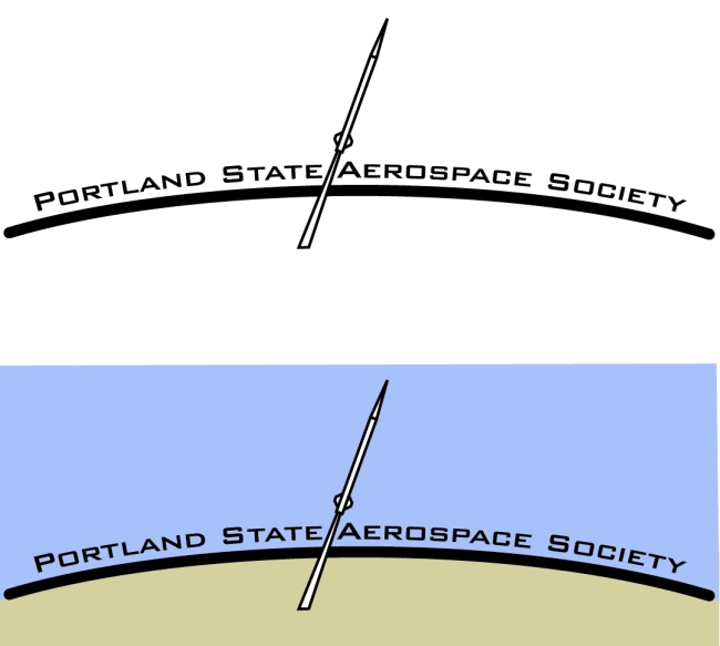
Logo Decision
On Wednesday, August 2nd, a vote was held at the general meeting. It was decided to use the new logo (logo #04) for a PSAS banner. It was also decided to use the new logo as the official PSAS logo.